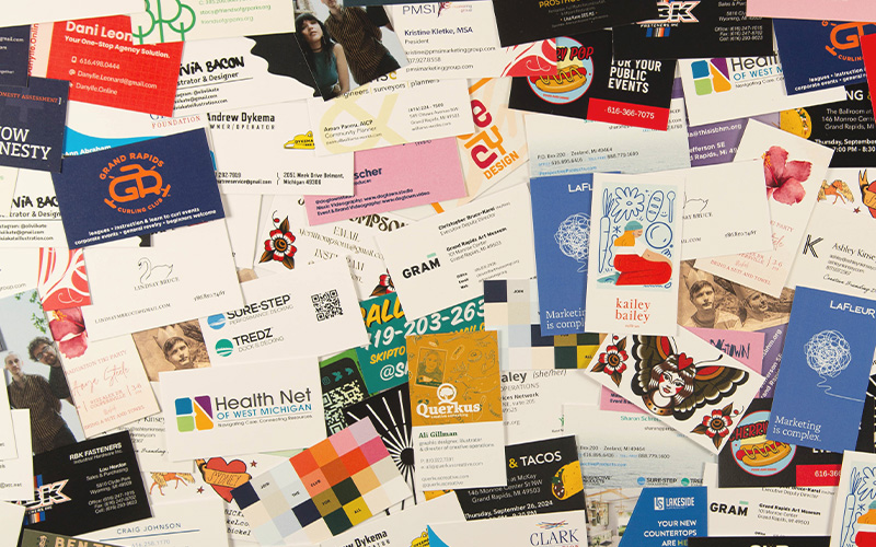
A business card is still one of the easiest, fastest ways to say: "Hey — I exist, and here’s how to find me again." Whether you’re handing them out at a market, tucking them into orders, or leaving a little trail of breadcrumbs around town, a good card does the talking when you’re not there to do it yourself.
How People Actually Use These Things
Hand them out in person
Toss one in every order you ship
Leave a stack at your favorite coffee shop or record store
Use them as mini art prints or collectibles
Loyalty cards, appointment reminders, punch cards
"Hey, scan this QR code instead of me explaining my whole business"
There are no rules here. If it fits in a pocket, it’s doing its job.
The Standard Size (Don’t Overthink It)
The most common size is: 3.5" x 2"
It fits wallets. It fits card holders. It fits the expectations of literally everyone on earth. You can go custom - and we love that - but standard is standard for a reason.
Setting Up Your File
If you’re designing your own file, here’s the quick-and-clean version:
Final size: 3.5" x 2"
Add bleed: 0.125" (1/8") on all sides
Document size with bleed: 3.75" x 2.25"
Safe zone: keep important text at least 0.125" inside the trim
Bleed ensures your background color or images go all the way to the edge after trimming - no crappy white edges.
Trim marks? Great if you know how to use them. Not required if your file is set up correctly with bleed.
Single-Sided vs. Double-Sided
Single-sided:
Clean, bold, memorable
Great for minimal designs or one strong message
Leaves room for people to write notes
Double-sided:
More space for info, branding, or visuals
Perfect for menus, appointment info, QR codes, etc.
Don’t over-do it
Sometimes the strongest move is leaving one side completely blank. That’s not wasted space - that's intentional design.
Design Tips from Someone Who Sees a Lot of These
1. Avoid tight borders
Especially on both sides. Even with perfect cutting, things can shift slightly. Tight borders will snitch on you.
2. Keep it simple
This is not a brochure. If it feels crowded on your screen, it’s worse in your hand.
3. Prioritize what matters
If someone only reads one thing, what should it be?
4. Contrast is important
Light gray text on a slightly lighter gray background will be invisible on a tiny business card.
5. QR codes are your friend
Let your card do less work. Link out to your site, menu, portfolio, whatever.
What Info Should You Include?
Whatever you actually want people to use...
Name
Business name
Job title
Phone number
Email
Website
Instagram / social handles
Physical address
Hours
You don’t need all of it. You just need the right stuff.
Paper
100# Uncoated Cover: My house stock - it's basic, but it gets the job done
16pt Coated-1-Side: I really like this for business cards; you can leave the back blank and easy to write on - great for appointment cards
French Paper: Made in Michigan, not-so-basic flavors, subtle flecks - I really think this is the best paper on the planet
A great design on great paper? When people ask where you got your cards printed - send them my way, I'll take care of them!